This website uses cookies to improve your experience while you navigate through the website. Out of these cookies, the cookies that are categorized as necessary are stored on your browser as they are essential for the working of basic functionalities of the website. We also use third-party cookies that help us analyze and understand how you use this website. These cookies will be stored in your browser only with your consent. You also have the option to opt-out of these cookies. But opting out of some of these cookies may have an effect on your browsing experience.
Always Enabled
We use necessary cookies to ensure our website works properly and provide essential functionalities and security features. These cookies do not collect any personal information and are always enabled. By continuing to use our website, you agree to our use of these cookies.
V:1 - 2024-09-13 07:45:43am
To enhance user experience, we use performance and analytical cookies to understand and analyze the key performance indexes of our website. Performance cookies help us deliver better user experiences by tracking metrics such as load times and response times. Analytical cookies help us understand how visitors interact with our website by providing information on metrics like the number of visitors, bounce rate, traffic source, and more.
V:1 - 2024-09-13 07:45:43am

This Halloween, our attention is drawn towards the scary world of age old web design and the risks associated with approaching web projects in the wrong vein.
Let’s look at some common horrors which occur by adopting a simple approach to web design:
Let’s cite a couple of reasons why a redesign might be decided upon. These reasons can typically range from:
Is your business approaching the design process the correct way? Design changes shouldn’t be taken lightly, and quite often, rash decisions can be made during the website design process, without having first investigated the potential impact of such decisions. Let’s look at this further…
There is a need to balance the requirement for a new, visually appealing website with the following:
-Analysis of user flows through the site, retaining valuable pages and dropping low performing pages. Use Google Analytics and behavioural insight tools where necessary (i.e. Hotjar, Decibel) to analyse and support findings.
-Where do your conversions happen. How can the new site support an increase in engagement and leads?
-SEO optimisation – will your website be indexed favourably by Google and is your digital agency factoring this into the website design process?
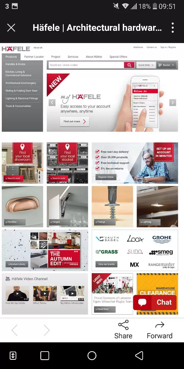
Unresponsive sites make our blood boil. As reported in 2015, with more searches being performed on mobile than desktop, no business can afford to have a website which does not render across variable screen sizes on desktops, tablet and smartphone devices. No business wants to inconvenience their customer base, so why make them fiddle around and pinching screens to view a website properly? Not having a responsive website is a surefire way of serving your mobile audience up to your closest competitors who already have one.

Example of a non-responsive website. Checked through https://search.google.com/test/mobile-friendly
When looking for agencies to work with, take a look at the work already produced by the creative agency. Conduct some research into how the agency works and send across your brief. The agency will advise and support with directing your business around the look and feel of the website, however your business should have already outlined what you are looking to achieve from any new website. What are your key services, goals and expectations?
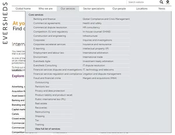
All user journeys should be intuitive. Overcomplicating websites with complex navigations, or content heavy pages with little context will only serve to increase exit rates and consumer dissatisfaction.

Screenshot of the Eversheds website navigation from 2015 . Detailed or overcomplicated?
There are a number of approaches that can be taken to streamline a user flow through a website. Where possible, websites should be clean and intuitive, with menus and navigations all grouped into categories and simplified. This allows for clear user-flows through the website, leading to the more likely outcome – a boost in website conversion rate.
Without understanding the ways in which users of your website interact, your business will fail to identify any underlying issues around why your website underperforms. The web design process has to account for the needs of external stakeholders as well as internal, especially if the performance of your site is cause for concern. As decision makers around the direction of the website, your business should always factor in the requirements of end users (your customers), as well as the needs and requirements of internal stakeholders.
Adopting a user centric approach with an established digital agency such as our own, will drive higher levels of engagement and improvements in conversions.
Contact ADAO today to discover how we can provide great user experiences for your customers.