
A great looking website can be exciting, but it will fall flat and fall short of expectations if it leaves users feeling confused or stuck.
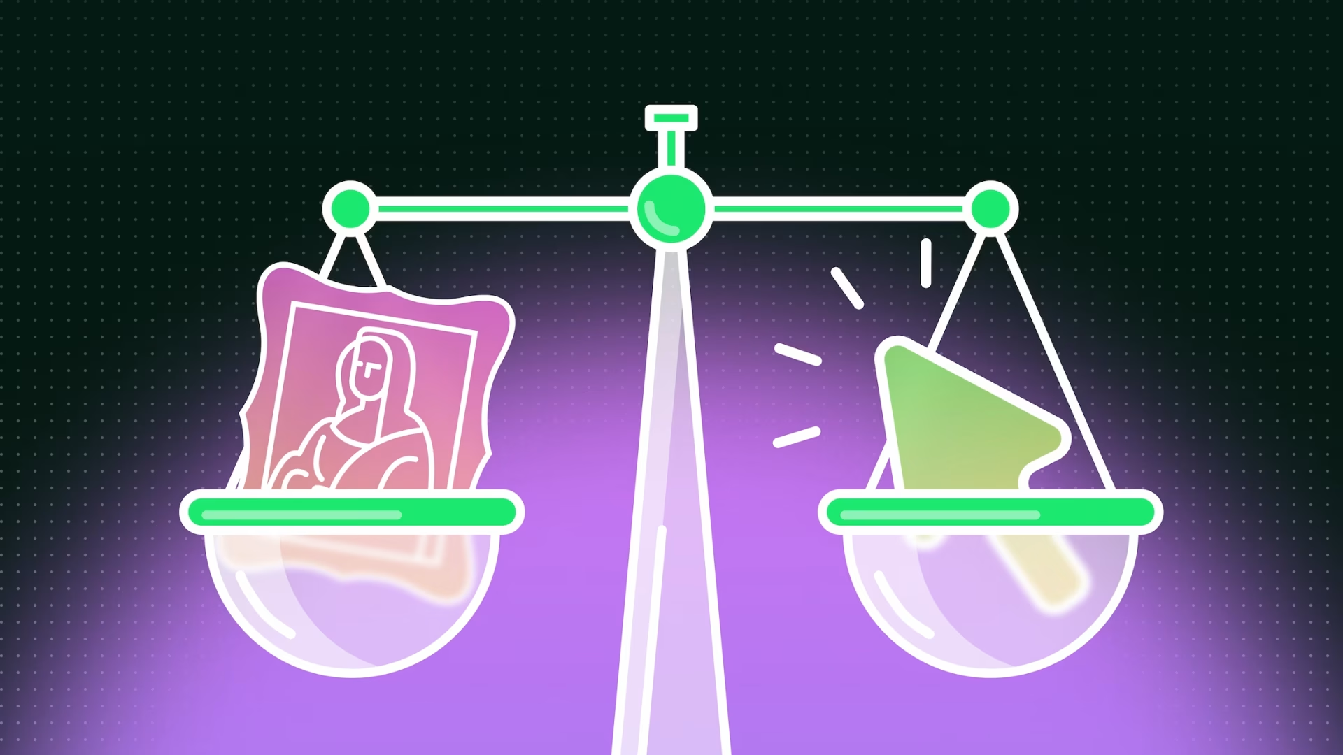
Great design is not just about appearance, functional web design is about creating websites that look impressive while still guiding users clearly and effectively.
A great looking website can be exciting, but it will fall flat and fall short of expectations if it leaves users feeling confused or stuck. Finding harmony between aesthetics and functionality can transform a design from a simple showpiece to an essential tool in your brand’s marketing arsenal.
Below are just a few pointers to start addressing your website’s interface / aesthetic equilibrium.
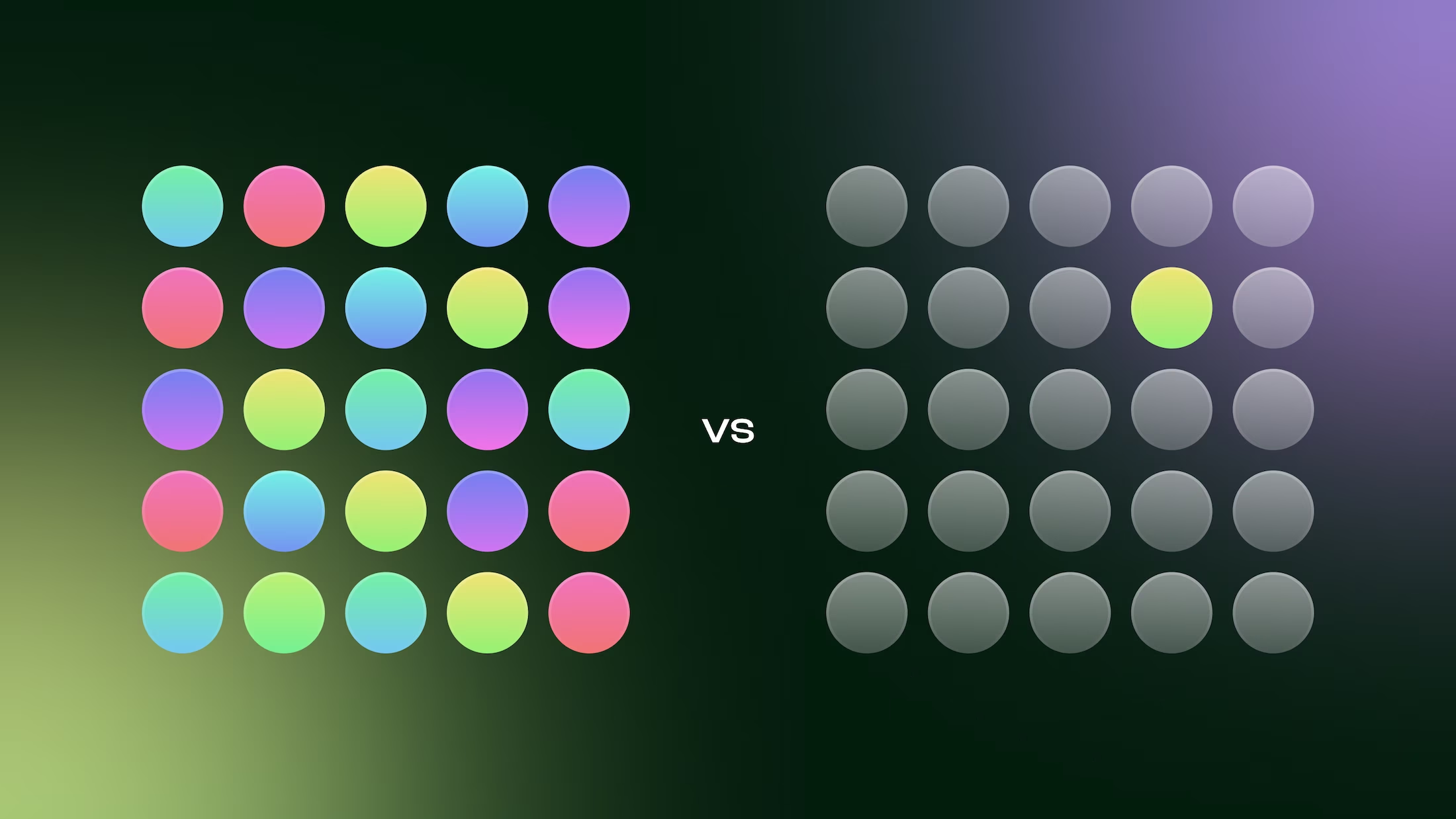
It can be very tempting to use the brightest, loudest, most contrasting elements to call out to your users. But in doing so, you’re diluting your most important actions by dividing their attention across a sea of buttons and links.
Restrained and targeted use of your brand’s accent colours, or high contrasting colour in general, can be the key to effectively signposting your users to the places you really want them to go.
UI elements that look the same are often perceived as equally important. Using higher contrasting elements less often signals to the user that there’s something different, or more important, about those actions.
Consider what your page’s primary actions actually are. If you’re on a Rooms page, it’s likely that you mainly want to direct your users to a booking platform. If you’re creating a job posting, you most likely want users to apply for the position.
As a general rule of thumb, try to limit your primary actions to one on the screen at any given moment.
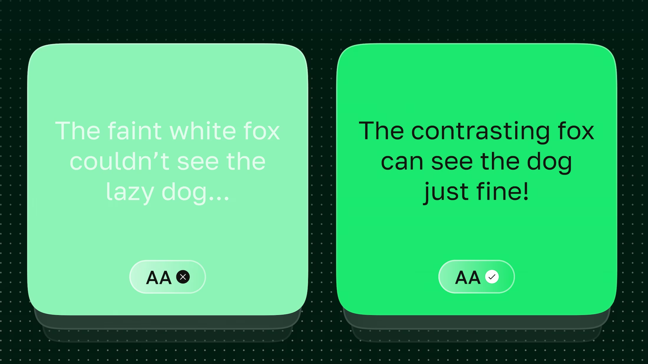
Subtle colour usage can be an integral component of a brand, and can be a very effective aesthetic to give a luxury or high-end feel. But if your users struggle to read and engage with your content, your rich appearance will result in a poor experience.
There can be a legal obligation to provide a suitable colour contrast for text and graphics (context-dependent). Websites in the USA are beholden to The Americans with Disabilities Act (ADA), and websites in the EU have a similar system under the European Accessibility Act (EAA). Both acts require text to pass WCAG 2.0 colour contrast metrics. There is also a newer colour contrast model called APCA (Accessible Perceptual Contrast Algorithm) which takes font weights, size and human eye perception into account.
Using a colour contrast checker app can help to signal whether your choice of font colour is appropriate for your users and supports accessible, functional web design.
That said, this does not necessarily mean that every single text element on a site must pass these metrics. Consider what text content is functional (e.g. paragraphs, headings, buttons, links etc), and what text is used purely for display purposes. A good rule of thumb: if the text was missing from the page, would it hinder the user?
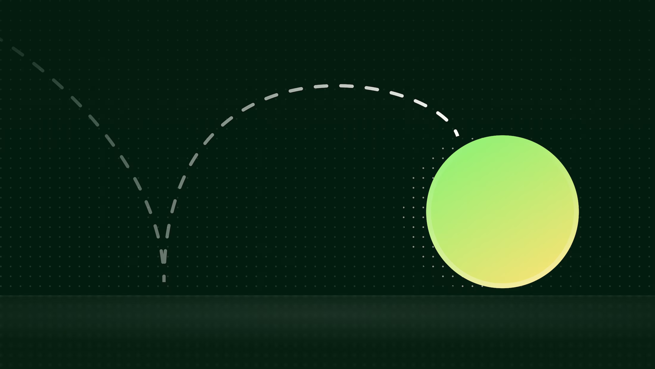
Sophisticated animations and transitions can mark the difference between a dull-as-ditchwater design and an amazing aesthetic. Used correctly, animations can also supplement user experience by suggesting direction, providing context or guiding the user’s eye. But beware – with great keyframes come great responsibility.
If the animation is triggered by an interaction, does it reflect the context? For example, if clicking a button to go to the next step triggers a page sliding animation, you would expect the page to slide to give a feeling of progression. (NB. In right-to-left languages, such as Arabic, this would be the opposite way around!).
Does the animation cause a shift in the rest of your page’s content? This can be a huge usability pain point if not carefully tested. Could the user accidentally click on something they didn’t mean to because a hover state moved the content around?
How about your animation’s durations? If they’re too long, this can sometimes be mistaken for performance issues, or could be annoying for a user if the animation is tied to an interaction.
Conversely, if they’re too short, there’s a chance it could feel choppy or even uncomfortable. Some users are particularly sensitive to motion and may indicate they prefer reduced animations in their browser settings. It’s important to respect this preference and provide alternatives to these users via the prefers-reduced-motion media query.
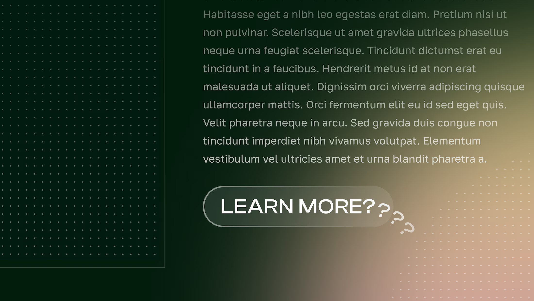
When we talk about aesthetics, we often think purely about graphics and imagery. But written language and tone of voice are just as pertinent here, and are just as important when it comes to making sure you and your users are on the same page.
When naming your navigation links, consider whether there’s any room for ambiguity. For example, you might decide the label ‘Savour’ could be a suitable label for your dining page in line with your tone of voice. But would your audience know this? There’s a risk of hindering a user’s journey, when ‘Dine’ could serve just as well as a substitute.
Does your button text provide enough context? ‘Find Out More’ and ‘Explore’ are often used as general calls to action, and they can be suitable as long as the surrounding context is obvious enough (for example, the link mirrors the section’s heading). Oftentimes, this isn’t the case, and users can be left guessing where they’ll end up if they follow a link. If possible, try to tailor your call to action to the content of the page link – for example, ‘View Wedding Packages’ or ‘Explore Offers’ can give a more valuable information scent to encourage users to progress their journey.
Ultimately, good design isn’t about choosing beauty or function as a binary, but finding ways for each to augment the other. With clear actions, accessible contrast, considerate motion, and purposeful language, functional web design can create a website that both delights and supports your users.
More Articles

![What the Webfont August 2025 [Blog Banner 16_9]](https://adao.co.uk/wp-content/uploads/2025/07/What-the-Webfont-August-2025-Blog-Banner-16_9-1024x576.png)
![The Power of Local SEO [Blog Banner 16_9]](https://adao.co.uk/wp-content/uploads/2025/07/The-Power-of-Local-SEO-Blog-Banner-16_9-1024x576.png)


In order to have the best experience, please update your browser. If you choose not to update, this website may not function as expected. Clicking the button below will help you to update your browser.
Update Your Browser Continue Without Updating