

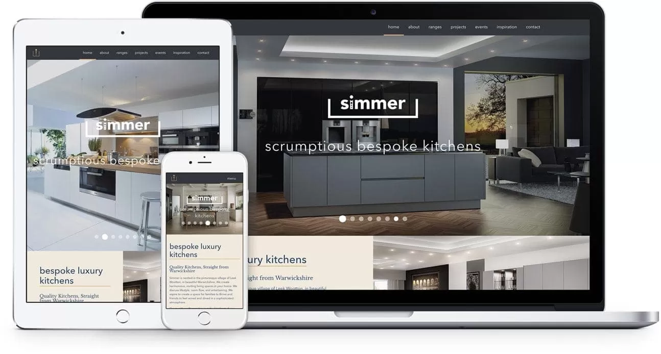
First impressions count. This is the case when meeting someone for the first time, whether it be a new work colleague, a new partner, or worse – the dreaded in-laws! The same applies to your website. The homepage itself can make up for over half of the total page views for your site. It is crucial that the look and feel of your site captures the attention and engagement of users (visitors), and is developed to deliver the purpose and objective that meets the needs of the end user, and your business.
It is important to understand that a website breaks away from the old adage of saying “don’t judge a book by it’s cover”. As a general rule, it is said that a user can form an opinion within the first 5 seconds as to whether or not they have landed on the website that they need. An important consideration is that 80% of users time will be spent viewing ‘above the fold’, according to world renowned user experience (UX) experts, the Nielsen Norman Group. Ultimately, this can often determine the length of time a visitor stays on your site, meaning it is critical that users of your site are exposed to your priority information – as it is likely to be judged ruthlessly. It should be a web teams prerogative to prioritise these areas, to direct users (in a considered manner) to key areas lessening the bounce and exit rates from the site and leading instead to engagement with key calls to action.
When landing to a website, it is important that the introduction to your homepage is kept concise. Beyond the obvious need for a strong visual aesthetic, there are a few key areas that will be immediately noticed by a visitor to your site. A study by Missouri university found that there were five initial key areas where the visitors eye-line focused on when landing on the page:
These points serve to highlight the considerations required for a more successful first impression when users land to a website.
Firstly, and as already alluded to, the design and development of your site is a critical factor for users. However, the most immediate thing that a user will notice maybe isn’t just the beautiful, inspiring imagery and vibrant visuals, nor the witty and captivating content. It is in fact the speed in which your website loads. It is important to always run a speed test on your site, as the longer a visitor is kept waiting (with images gradually rendering and buttons randomly popping up) the worse the experience, and the more likely the drop off rate increases from your site – no matter how nice it looks when all loaded!
Secondly, your website reflects your company’s credibility. Having an up to date, fresh design that makes use of the latest trends portrays a company with integrity, that cares about it’s digital presence and audience (visitors to the site). The body of a website’s content (whether that be image and video or blocks of text and headlines) should work hand in hand within the fabric of the design, reinforcing a company’s brand identity and effectively showcasing the array of products or services provided through the website.
Finally, and arguably the most important is, does it show the user what to do? Nothing is more frustrating than landing on a page with no real flow or indication as to where the user should be clicking next. The objective should always be to provoke interaction. One way in which this can be achieved within the design and makeup architecture of the website is to use attractive calls to actions (CTAs). These should never be an afterthought or shoehorned into a design. Being fully accustomed and well-versed in site design, CTA buttons should be clearly labelled and highlighted. Strong terms over the traditional label ‘Contact’ could be ‘Discover More’ or ‘Enquire Today’. When incorporating the use of colour, there needs to be consideration around the psychology behind colours, as these have the ability to evoke different messages. Think about what you want to portray whether it’s experience, trust or intelligence.
With the above considered, here are some simple steps to consider when creating a new website, that will help it flow with natural progression, working to deliver an impact!
With studies indicating that 94% of a user’s first impression is based on the aesthetic of a website, there is much justification for following these considerations summarised above, for creating a more positive first impression with your website.
This is why it is important to ensure your website is well designed, developed and maintained once you press the ‘go live’ button, as it is that first impression that will serve to generate trust, which should lead to a greater interaction and conversion rate.
As outlined from the top of this post, we always like to leave great first impressions. If work colleagues can become lifelong friends and positive relationships can be struck up with the in-laws; why can’t your website serve to deliver the same, great impression!
Contact ADAO today to discover how we can generate a great, first impression for your business.