

Our web and digital marketing agency has worked with a number of clients in the education sector. In fact, our team currently work with a well established International School in Brussels.
When taking on any web project, our designers and developers always look towards delivering effective user experiences to all stakeholders; typically teachers, students and parents for educational sites. From the commencement of such projects, our web team work to identify existing key journeys through a website, and look to identify any kinks or pitfalls which may have a detrimental effect on user engagement with key calls to action. These can often be attributed to poor structure, layout and/or design in negatively affecting performance.
One great interpretation of user experience (UX) can be cited from Dan Makoski (VP of Design at CapitalOne), “you can’t design experiences, but you can design for them”. This quote is quite apt, delivering a message that if organisations know as much as possible about users of their website, they can deliver websites which deliver exactly what users want. The user interface (UI) design is therefore a critical element towards achieving the goal of designing for great user experiences, as the design of a website is what impacts the user on landing to a website for the first time.
We live in a digital age where device usage is increasing rapidly every year, especially amongst those of an age where they are using online search for various schools or universities. The expectation from this key user group is to be presented with a website which not only looks great, but is able to deliver by providing clear signage, easily digestible content and which provides these very users with the ability to engage and interact without stumbling blocks in place. This is all supported by a recent study that found that 32% of students said technology played a part when choosing their university, a percentage which those working within the education sector need to pay close attention to, by having responsive websites for all device types, and which serve to impress on the design front. Moveover, the higher education sector is as competitive now as it has ever been. It isn’t just University league tables and location that matter, it’s first impressions. If your University website doesn’t deliver a WOW factor, students can be off-put; especially if those students are looking towards studying a design orientated course!
I was in my final year at the University of Gloucestershire (UoG) in 2008, only one year after Apple’s release of their 1st generation IPhone. For most students in that year, we were using flip phones at the time and had no idea what a responsive website was. Here is the earliest screen grab I could find of the UoG website.
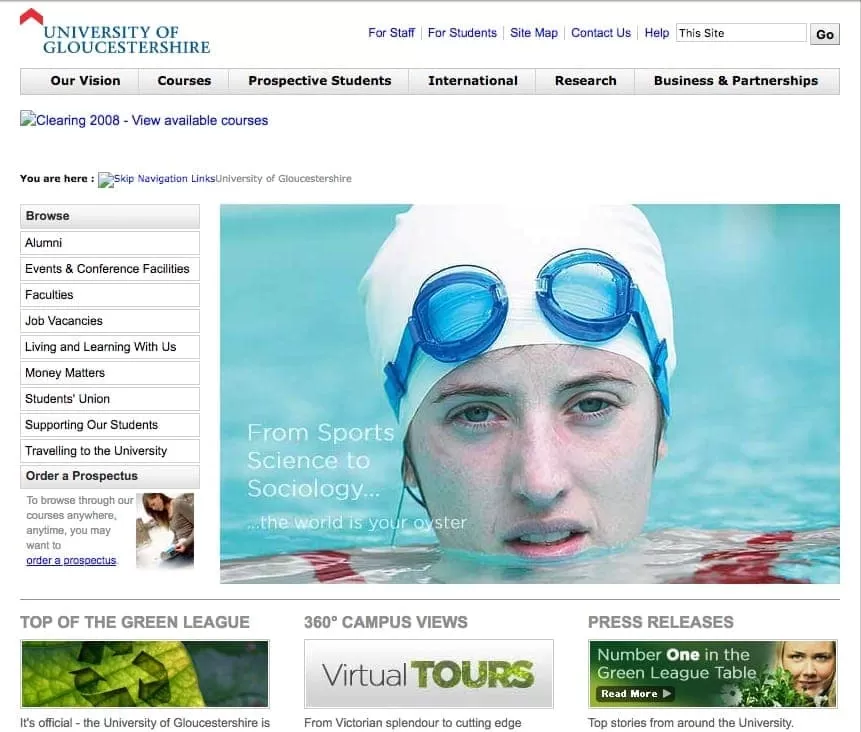
Screenshot from 2008
At top level, the website itself was very clean design wise and well presented for that time, with the key features clearly indicated to users within the top navigation. The most advanced feature was a 360° tour, a popular feature for the time which provided a more impressive beyond static images into the layout of the campus. Similarly to other universities, UoG didn’t need to think too hard about delivering a responsive design as general smartphone sales had not really impacted as already alluded to. In all honesty, responsive was barely a concept at this point in time. If looking at the most popular smartphone in the market, the iPhone, there were just 1.39 million sales worldwide in 2007, compared to 231 million reported in 2015.
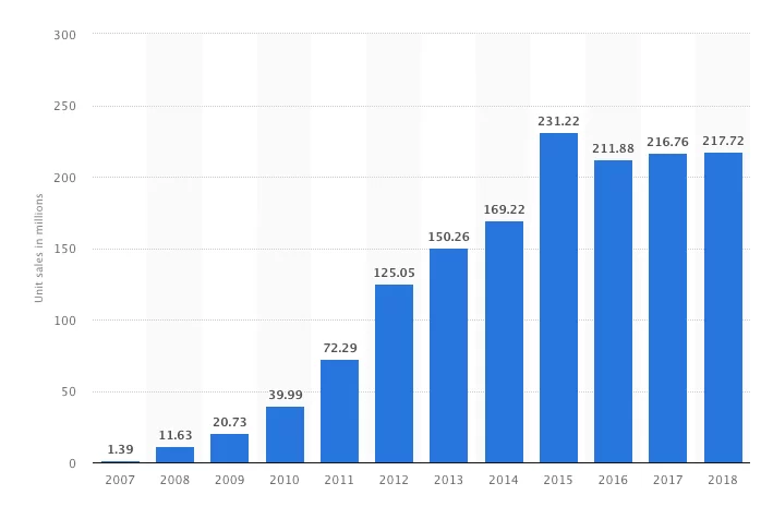
Unit sales of the Apple iPhone worldwide from 2007 to 2018 (in millions)
Where we see Universities nowadays placing an emphasis on social media, by linking the widgets to the homepage, the UoG and other Universities would not have focused so much attention on this back in 2008. Facebook had only launched across the UK in 2005, so it comes as no surprise not to see social icons on the homepage design from 2008. Instagram (which is now huge, and still growing) was no where to be seen at that point.
Despite the lack of social presence, the UoG website did deliver on my expectations and requirements, as the website functioned well on my laptop, which (before smartphones were introduced) I used most days to browse the web.
Fast forward a number of years to 2014, and (in preparation for returning to an Alumni event) I decided to revisit the UoG website, where I noticed that a drastic change in the user interface (UI) had occurred. What was noticeable was the introduction of social media channels on the homepage and a larger hero image, displaying a forward thinking approach by the creative team designing the University’s website. However what struck me most was the inconsistency shown with the brand logo in multiple colours, and the bold choice to use turquoise on a pale brown background. Although not a designer, I do work to market websites on a daily basis. Perhaps overcritical, but the site was not easy on the eye, and i was put off by the poor choice of colour on the site, and dull borders on the homepage.
The key factor of delivering a smooth user experience is to be smart with colour when designing websites, something seemingly overlooked by this version of the site. Moreover with my laptop now collecting dust and now using smartphone technology to browse websites, the site had not yet become responsive, which was a frustrating experience!
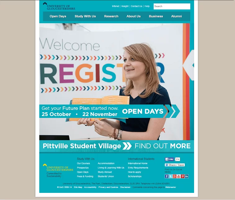
Screenshot from 2014
Having checked back to the UoG website again recently, I was pleasantly surprised to have noticed the short lived design above had changed. UoG had clearly paid closer attention to the expectations required from a website, and listening to industry trends by taking more modern approaches to the design of their site .
What is noticeable with the latest version of the UoG site is that the website is now much improved. The turquoise has now shifted from being the primary colour scheme to being used to effectively highlight call to action (CTA) buttons such as “chat now, apply now”. Lastly, the website is responsive to render well on smartphones.
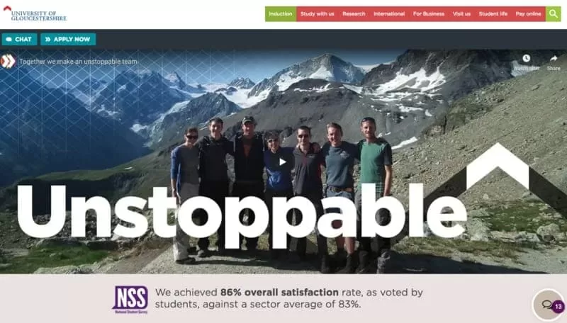
Screenshot from 2018
There are many challenges for schools, colleges and universities when it comes to addressing the usability of their websites. As highlighted within this post, it took the University of Gloucestershire the best part of 5 years to achieve a nicely designed responsive website.
What we can learn from UoG as a case-in point is, if a project managed approach to UX is adopted in the first instance, education institutions can improve their chances to:
Although design is a critical part on first impressions and a crucial factor which impacts upon a users experience; the accessibility and functionality of a site are as important. As is providing seamless user flows through the website, allowing for visitors to reach their objective through your website as quickly and easily as possible.
When looking at redesigning your website, there is an importance in having an in-depth understanding around the current performance, and for the website to deliver on the objectives for users of the website, not just the requirement of internal stakeholders within your business.