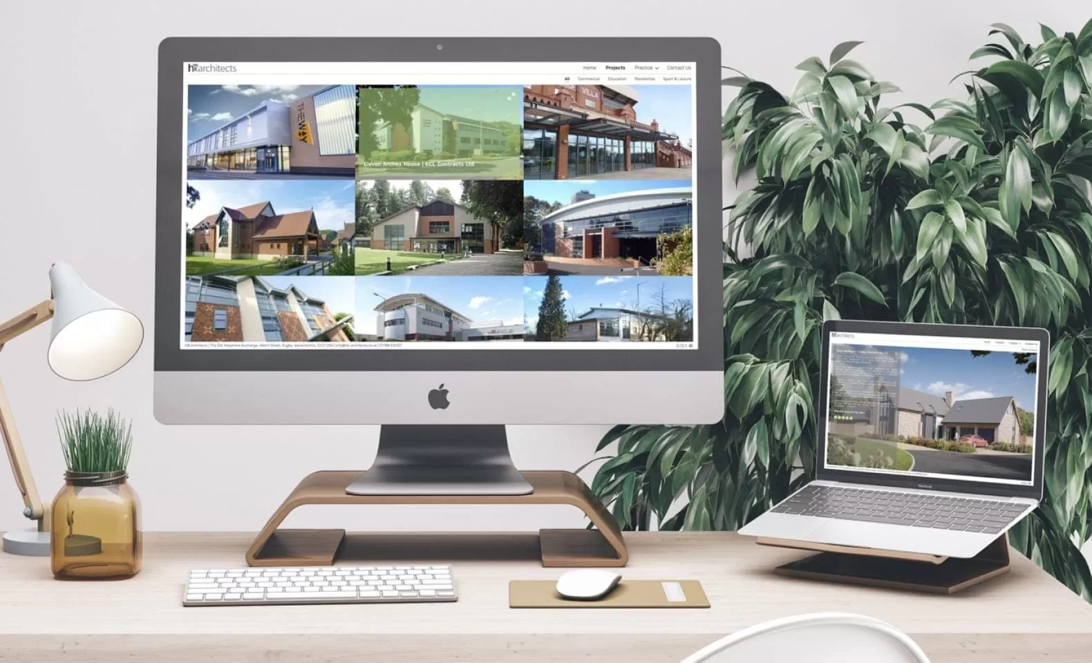
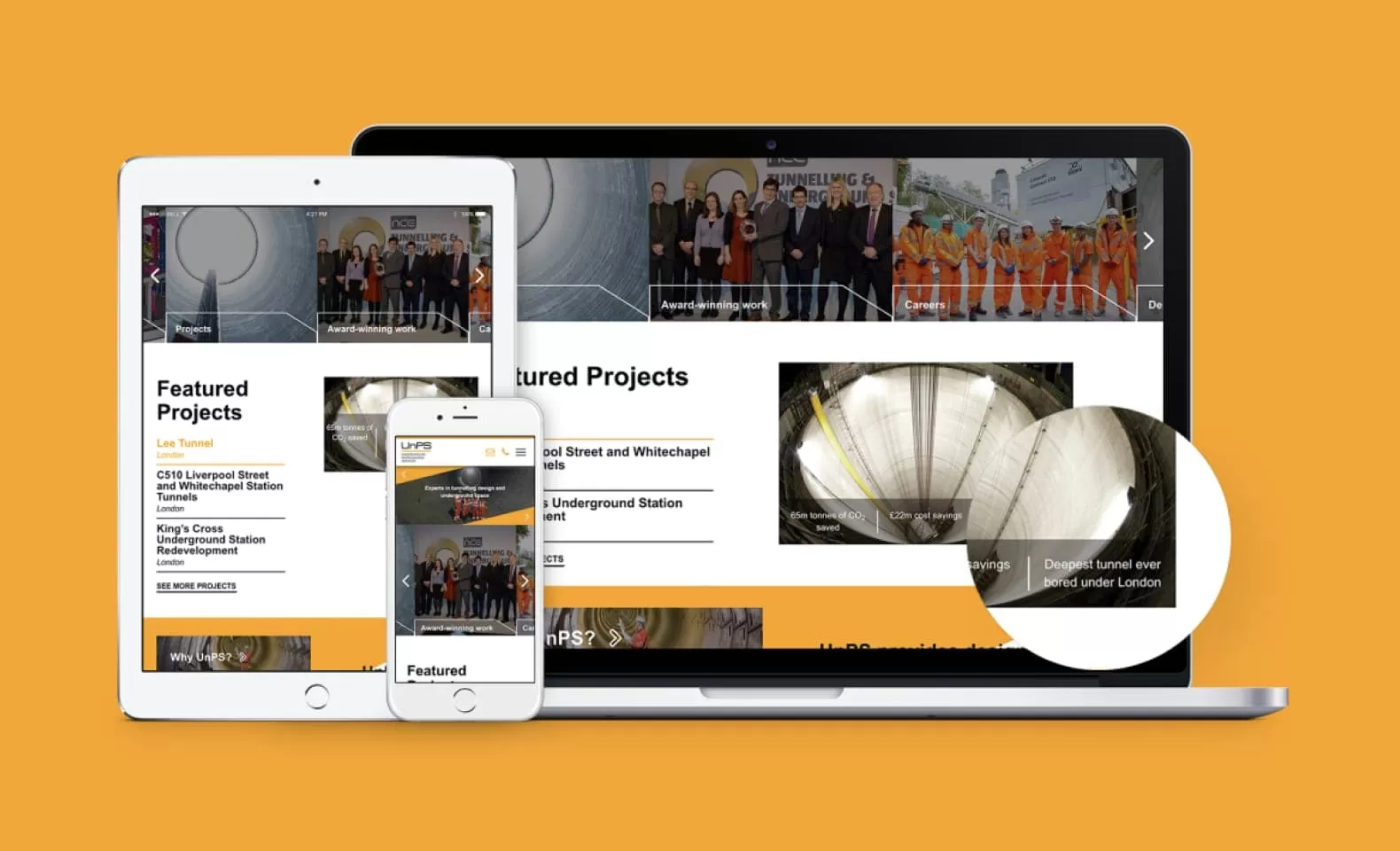
What is Responsive Design?
Responsive web design is the art of creating websites which contain scalable content which automatically adjusts dynamically across all device types, from large monitors to tablets and mobile devices. A nice responsive website will serve the user with clear, visible information and signposts to key calls to action your business is trying to achieve. This should require no extra effort from a user’s perspective, and should eliminate unnecessarily frustrating actions such as having to pinch the viewport on their mobile devices to zoom into content to make it legible.
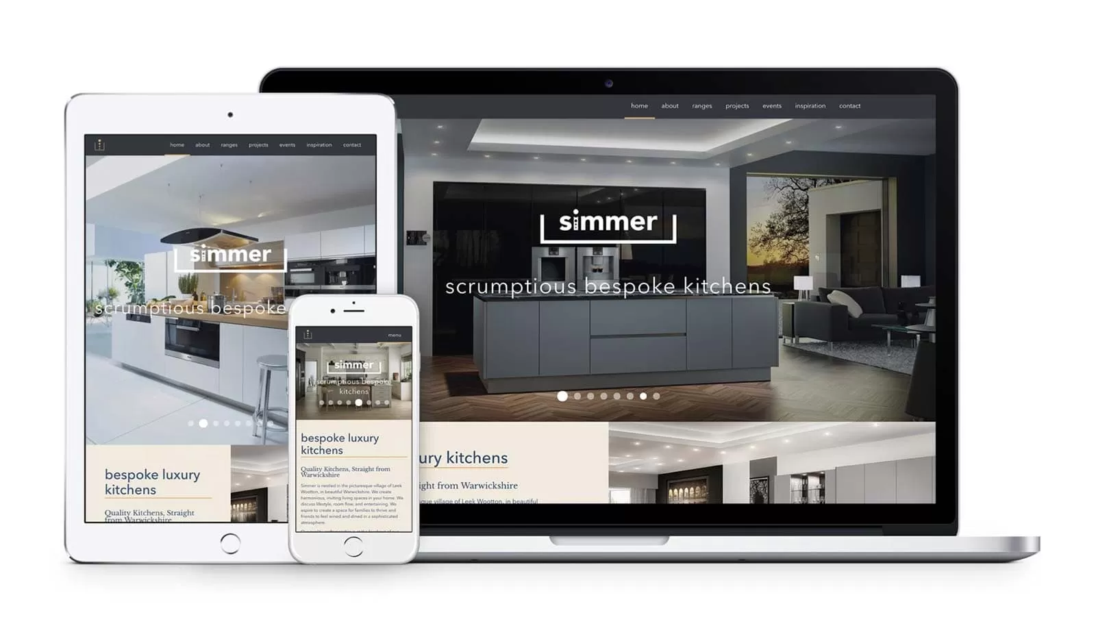
A responsive website for Simmer Kitchens
Always Thinking Mobile First
Responsive design has been a standard practice across web agencies for many years now. It was also well publicised in 2016 that the number of mobile searches for websites overtook search through desktop.
With this considered, it is especially concerning if your business doesn’t cater to customers across all device types. Having a website with content which is only adapted for a desktop computer not only limits and restricts engagement with your business, but also negatively impacts the conversion rate.