
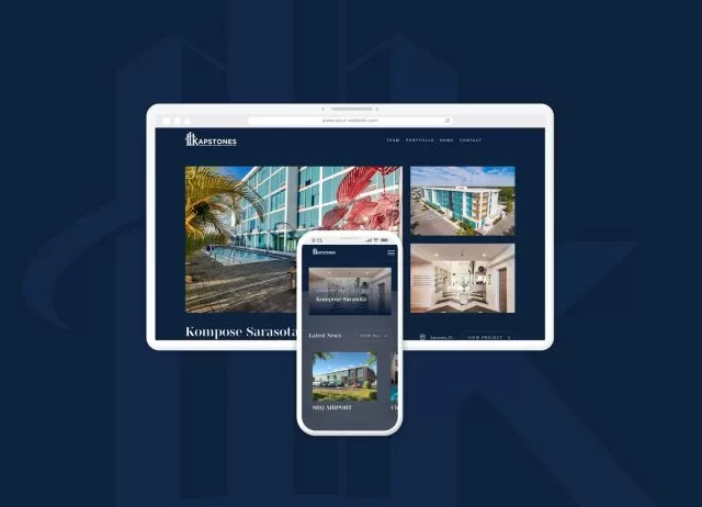
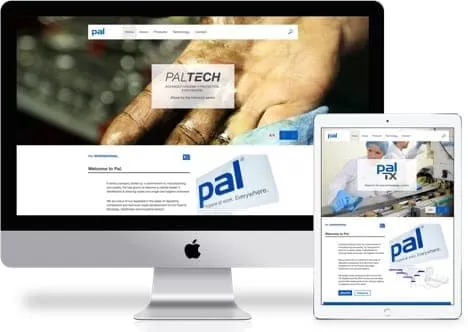
A responsive website designed from the outset to look great on large screens to mobile devices. The experience was art directed to offer a great experience across platforms.
The site was built completely custom with WordPress CMS with a flexible page builder module, to allow entirely new pages to be constructed in an intuitive manner.
A website suitable for large screens, right down to mobile devices. The experience was art directed to offer a great experience across platforms.
The site was built completely custom with WordPress CMS with a flexible page builder module, to allow entirely new pages to be constructed in an intuitive manner.
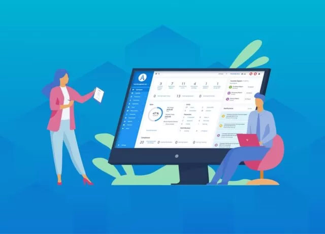
Mobile Traffic
Organic Traffic
Unique Visitors


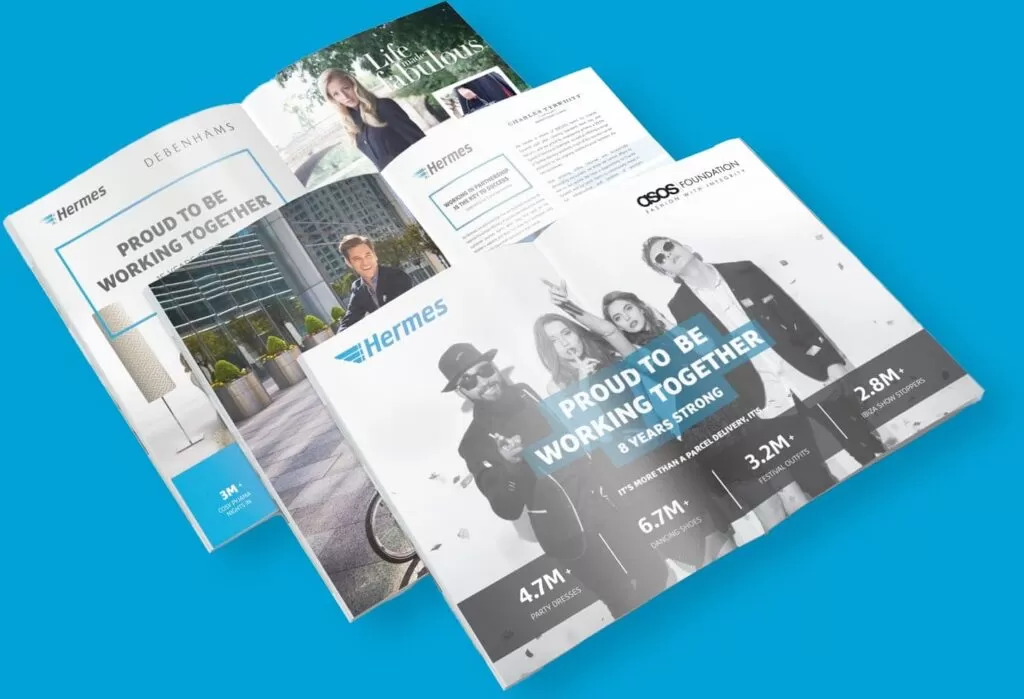
A plethora of print and digital designs for one of the leading online delivery services in the UK.
Print, Digital Advertising, Graphic Design